Honey bee viruses have been widely surveyed and sampled for through the USDA APHIS Honey Bee Survey, BIP Tech Team samples, Emergency Response Kits, and other samples processed through joint co-operations through the University of Maryland bee lab. To share the results of these surveys through an openly accessible visualization, we have released a dynamically explorable map of viral results in the Bee Informed Database. This map will continually be updated as new and old data is uploaded to the database.
Viruses are clearly implicated as a major driver of colony losses and economic impacts. A number of viruses are spread by varroa mites. Direct treatments of viruses are currently unavailable. Beekeepers attempt to limit damage by viruses primarily by controlling varroa mites. If you are not familiar with honey bee viruses, here is a good introductory article at eXtension.org.
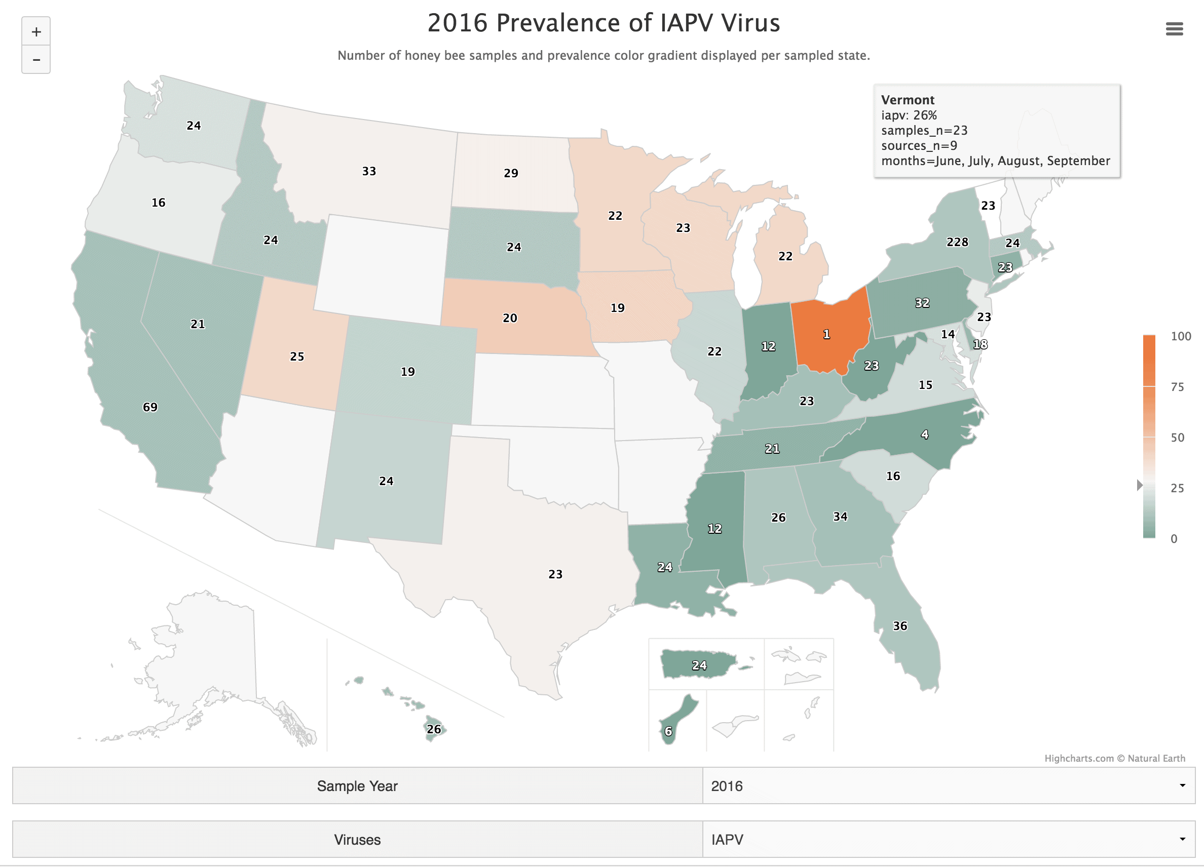
Before digging in to the map, let me explain what the map represents and how to navigate it. In the screen shot above, there are two drop down menus with 2016 and the virus IAPV (Israeli Acute Paralysis Virus) selected. We currently have 9 years and 10 viruses available to select. Not all viruses were sampled in the same year. It is important to note that since this map includes data from multiple projects, labs and procedures, differences represented among states and years may be significantly influenced by variability in protocols.
That said, in the screen shot above we see the prevalence, or percentage of samples found to be positive for IAPV per state in 2016. The color gradient increases towards red as a higher percentage of the samples are positive. The number displayed over each state is the number of samples taken from that state. Therefore, in this example we see that only one sample was taken in Ohio in 2016 and it was positive for IAPV, giving a prevalence of 100%. The states surrounding Ohio have a higher number of samples and we can get a more realistic understanding of the prevalence of the virus in those states.
As you hover over the states, you will see a popup appear as seen over Vermont in this example. After the state name and actual percentage of positive samples, we again display the number of samples, but after that, there is a value for “sources_n”. This is the number of apiary owners represented per sampling project to give you an idea if the samples are limited to a few apiary owners or if the samples are more widespread in the state. Finally, the months the samples were taken is given. For some viruses, time of year correlates with their presence so this can be yet another source of variation among states.
In this map, we can see the prevalence of IAPV is fairly variable for 2016. It is sometimes common and in other locations, more rare. If you were to begin switching years with the drop down menu, it would appear that this virus is becoming more prevalent in recent years, particularly in the upper mid-west. However, I would not consider that a very scientific analysis. Ideally, we would want to run statistics to account for the sources of variation to see if differences in sample protocols explain the increase in IAPV, or if we can instead conclude IAPV is truly increasing in prevalence. This map is a data visualization, meaning that we can use it to better see what data we have and from there formulate questions to investigate.
I invite you to explore this map, and post questions or interesting insights you find in the comments section of this blog post. There may be scientific journal articles or other resources that you may be able to find that investigate things you will notice exploring the map. For example, I found that Guam is fairly free of any viruses, except LSV2. This prompted me to find out if varroa has ever been found there. Here is a related interview with our Guam cooperators whom took the samples and discussed the recent discovery of varroa. One last caveat I’d like to add is that although you will see varroa related viruses mapped for the entire state of Hawaii, not all of the Hawaiian islands have varroa, and are therefore unlikely to have the listed viruses. This map does not delineate the islands separately. Thank you for your time and happy exploring!
