There is a new link on our homepage titled “Explore!”. Click here to explore the ever growing Bee Informed Partnership Database. Here we have new, interactive pages that allow you to view detailed honey bee health data from survey and sample efforts. You can view yearly, state loss data for the annual loss survey in an interactive map. Then, you can look at differences in loss levels based on management practices, filtering to any year or state of interest. Interested in pest levels found in your state? On our ‘State Reports’ page you can explore USDA APHIS honey bee survey data to find out varroa and nosema levels, viruses found, and pesticide sample analysis nationally, yearly, or by sampled state. Finally, you can enter your own varroa levels in a new interactive program called MiteCheck. These new features are just the beginning of a new strategy to turn the Bee Informed Partnership data collection and reporting system into a self service, online, interactive experience to both collect data and provide insight into the forces effecting honey bee health on a national scale.
Colony Loss Map
Stay tuned for the 2015-2016 state loss data, but until then explore state loss levels at this link all the way back to 2007-08 when the honey bee winter loss survey began with the Apiary Inspectors of America.
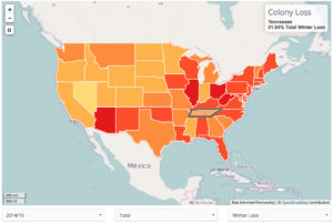
The interactive map shows state losses as a heat map with higher losses being darker red. You can select the year of interest and if you want to look at winter loss, annual loss, or summer loss. You can also look at either Average Loss or Total Loss. Total loss looks at the number of colonies reported on and gives you a percent of all reported colonies lost while Average Loss is a calculation of the loss experienced by an ‘average beekeeper’ in that state.
There is a table below the map that filters out to the states surrounding any state you select. Here you can find details about how many beekeepers reported, the number of colonies represented, and the number of colonies exclusive to that state. For migratory operations, their loss gets reflected in each state they operate in, so use these numbers to weigh in on if the state’s Total Loss is heavily influenced by a few large beekeepers. In those cases, you may want to look at Average Loss where each beekeeper carries the same weight, irregardless of how many colonies they operate.
Management Survey
For years now with the honey bee loss survey, we have been asking beekeepers what they do to bring insight into why losses are so high. We can’t really prove any causative effects through a survey, but we can look at patterns and correlations to give us good directions on where we should direct our efforts as beekeepers and researchers. In the past, those reports have been generated from the database in static .pdf files here. That worked out OK to look at individual issues in a single year, but is cumbersome to look at the same question over multiple years. We have now rectified that by providing a new, database explorer linked here to interactively filter based on year, state, operation size, and a number of questions.
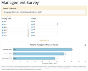
Now, you can select a number of products beekeepers use and compare beekeepers that use those selected products to those whom did not. You can then filter that to any year, or only the states you are interested in. In addition to getting the level of loss, you can also simply see how many people use a particular product or feeding practices. If you’re a backyard beekeeper and don’t see how commercial beekeepers are comparable to what you are doing, then just filter to backyard beekeepers only. However, as you can see in the screenshot I pasted in here, backyard beekeepers often have higher losses than commercial and sideline beekeepers. Therefore, you might also try filtering only on those groups to see what they are using as well.
You won’t see the checkbox filters as the page loads to save on space. You will need to click on the button to ‘Show Filters’ to see them, so be sure to do that if you want to explore more deeply. Also, be sure to note that these loss levels are reported as Average Loss, or the loss experienced by the average beekeeper of the selected filters. Therefore, the loss you see can be quite different and higher the the usual Total Loss numbers we usually use to report overall national losses. The ‘Survey Year’ is the year in which we conducted the survey. So, 2015 is the winter of 2014-15.
State Reports
The newest addition to the new database experience, is the USDA APHIS State Reports page here. This page provides a very in-depth look at APHIS National Honey Bee Survey data collected since 2009 in collaboration with state apiary inspectors. I hope to provide a more detailed article about this feature at a later date, but for now here are the basics.
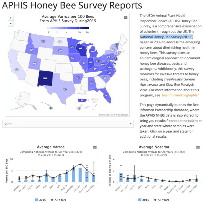
In the screen shot above, take note of the year selector below the map. From there, you can select which year the map displays the average varroa level found in the sampled states. Graphs below also will dynamically update to show you the trend nationally for all years compared to the selected year for varroa, nosema, viruses, and pesticide levels. Next, you can click on a state and you will get detailed information about the samples taken in that state. You can see what counties are sampled, and the viruses, pesticides, and pest levels found.
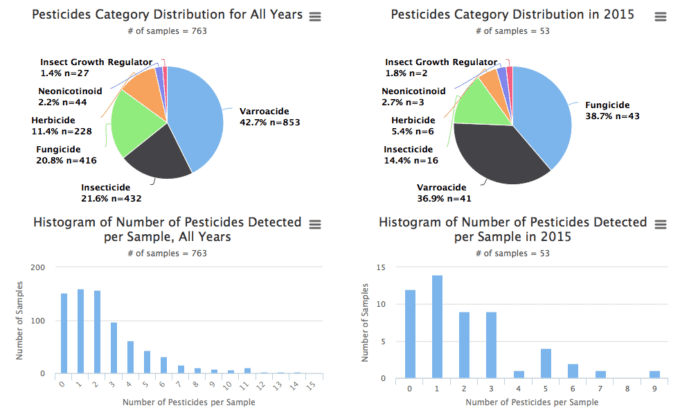
Pesticide effects on honey bees is an area of great interest, but relatively little information perhaps due to the expense surrounding taking samples. In the APHIS survey, to date, 763 samples have been processed giving us the most comprehensive look at the level of pesticides found in colonies that we have. You now have access to what pesticides have been found, their prevalence, and where they were found through the individual state reports. Since these samples were not taken as a response to a loss event, we consider this data, and all the data in the APHIS survey, random samples, or the average levels found, providing baseline information about what US colonies experience.
MiteCheck
I hope you learn a lot exploring our database, but why not go a little further? You too can provide data through our surveys, sample monitoring programs, and now in collaboration with the University of Minnesota and Michigan State, you can enter varroa level information and compare it to other respondents in a new interactive page called MiteCheck linked here.
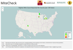
MiteCheck refers to sample kits developed by the Bee Squad of University of Minnesota. These kits provide everything you need to take a varroa sample and conduct a powdered sugar shake to asses the level of varroa infestation. To complement that, we now have this page to collect that data you are generating with your MiteCheck kit. If you don’t have a MiteCheck kit, you can still enter powdered sugar varroa assessments anyway, but the kit provides instructions to do it right.
We are looking for funding to expand the MiteCheck program, so hopefully you will see an increase in the functionality of this page in the future. MiteCheck is the first example of the Bee Informed Partnership Database as a platform for additional interactive bee health initiatives funded through other sources. The original USDA-NIFA grant funding the Bee Informed Partnership expires in December of this year. One of its legacies is a platform for new and continued bee health data collection and dissemination. Your participation and support will continue that effort with rewards in more depth and data based understanding of bee health.
Conclusion
Well, that’s all for now, but that is a lot! I hope you spend some time exploring the database and let us know what you find out by commenting about it here. In coming months, perhaps by the time you read this, we will have the 2015-16 loss and management survey data included. New APHIS samples are being included on a regular basis, as well as additional MiteCheck responses. The database is a living document, reflecting new information as soon as it becomes available. Planned future functionality will include insight into the Sentinel Apiaries program. Our idealistic goal is to provide beekeepers with a way to manage their own colony health information and place that information in a context that informs management decisions. Commercial beekeepers participating in Tech Team sample programs benefit from the database by receiving their reports via email. Providing self service access for personalized and protected data for Tech Teams is also an area we are pursuing as a part of the new features in development. We are increasingly living in a data driven world, and complicated issues like beekeeping can benefit from these technologies.