If you haven’t heard by now, the Bee Informed Partnership has been hosting an annual management survey for many years. The survey is data intensive and collects detailed information about many different aspects of beekeeping. The survey has reached tens of thousands of beekeepers and has spanned the better half of the last decade.
The survey has proved to be very successful and has generated a significant amount of data. Our team of researchers and technology professionals have spent many years analyzing this data to gain a clearer picture of honey bee health. Now, we want to make this data easily accessible to everyone by releasing a new app called the “National Management Survey Explorer”. You can start using the app today at https://bip2.beeinformed.org/survey.
The purpose of the app is to allow the beekeeping community direct access to the database and make the monofactorial correlations easy, informative and fun to explore. The app replaces our older, static PDF reports with fully interactive reports permitting immediate results.
A Quick Tour
Reports List
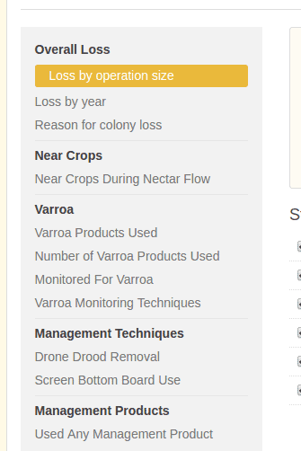
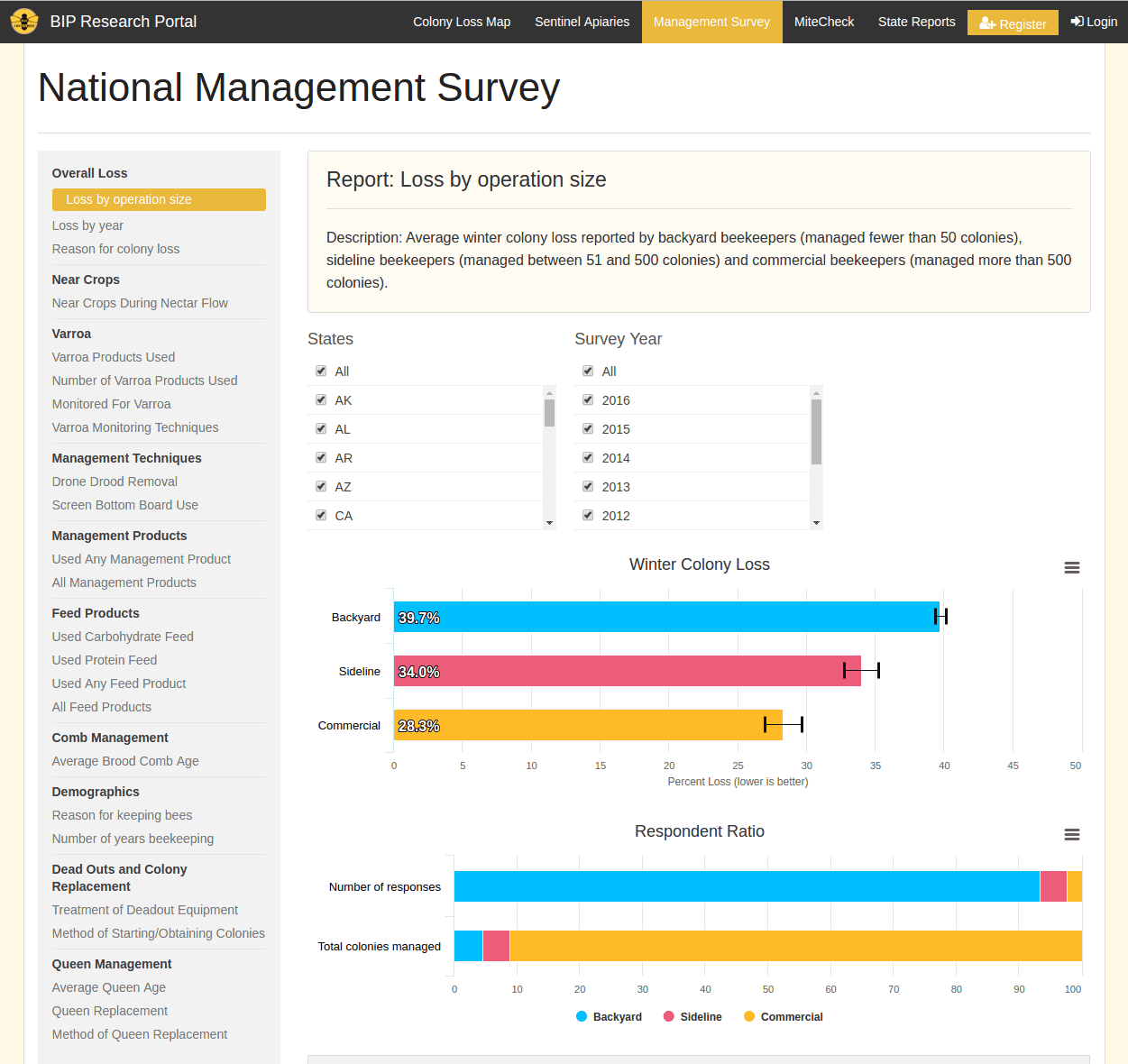
The first stop is the left sidebar that gives you a list of all the available reports. The report you are currently viewing will be highlighted with a yellow box. In the above screenshot, the first report, titled “Loss by operation size” is selected. The title of the report also appears in the report info box. You can view a different report by clicking on any of the links in the sidebar. Give it a try!
Report Info
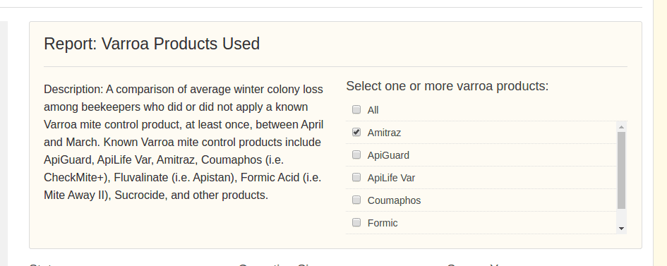
The second stop of the tour is the report info box which has the title of the report and a short description. Some reports (like the one pictured above) also have extra options you can choose from.
Some reports are more free-formed than others and allow you to compare specific products and techniques. In the above report “Varroa Products Used” you can choose various varroa products to compare. The report simply compares beekeepers who reported using any of the products you picked versus beekeepers who did not use those products. In the above example, “Amitraz” is selected so you compare beekeepers who reported using the Amitraz product versus beekeepers who did not report using it.
Response Filters
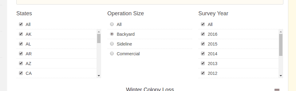
The next stop is the response filters. Beekeepers who take the survey can be divided up in a couple of different ways. The state that they keep bees in, the number of colonies they managed, and when they took the survey. Feel free to choose different options and watch the charts respond accordingly. For example, if you are interested in how commercial sized operations faired you can change the operation size filter from “beekeeper” to “commercial”. Or, if you’re interested in only seeing data from last year, you can unselect all the survey year options by unchecking “all” and then checking “2016”.
Winter Colony Loss Chart
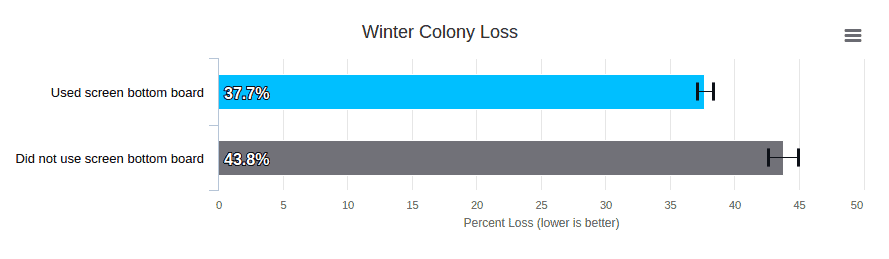
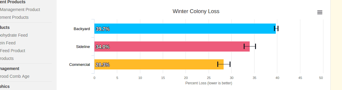
This is the most important stop of the tour – the average winter colony loss chart. The purpose of this chart is to compare how well different groups of beekeepers overwintered, which can be a standard measure of honey bee health. The length of the bar represents the percentage of a beekeeper’s operation that was lost during the winter months (October-April). Obviously, we want these bars to be as small as possible.
To get technical for a second, the average winter colony loss for a group is calculated by averaging each survey respondent’s average colony loss. That means the respondent’s operation size is not taken into account so all respondents are weighed equally. In order to account for this it is recommended that you change the operation size filter to the operation size you are interested in. In a future update we will provide an option to switch to the “average total colony loss” calculation which does take operation size into account but has it’s own nuances to keep in mind. No one ever said science was easy…
Anyways, depending on which report you have selected you will see different groups represented in the chart. In the above example (from the “Screen Bottom Board Use” report for all states, all operation sizes, and all survey years) we have two groups: “Used screen bottom board” and “Did not use screen bottom board”. As you can clearly see from the chart, those in the “Used screen bottom board” group reported significantly fewer losses than those in the other group.
You may have noticed the little black lines attached to the ends of the bars. These are known as “error bars” and they visualize a 95% confidence interval. If you don’t know what that means, that’s okay. Basically, they represent how varied the average loss was in their group.
Respondent Ratio and Summary Table
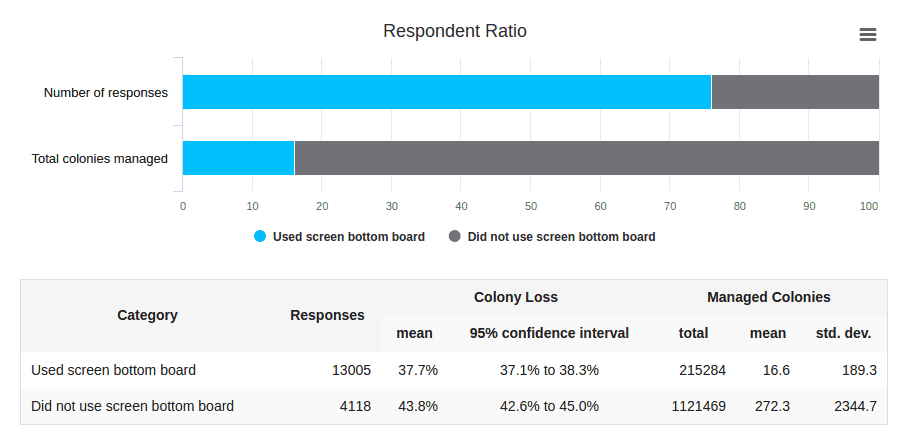
The last stop of the tour is the respondent ratio chart and the detailed summary table. The respondent ratio chart is color coded to match the winter colony loss chart above. The same groups on the winter colony loss chart are shown here in two different bars. The top bar is based on the number of survey responses and the second bar is based on the number of colonies those respondents managed in their operation.
The purpose of this chart is to give you an idea of how many people actually fall into each group. The above example is from the “Screen Bottom Board Use” report for all states, all operation sizes, and all survey years. In this example, the first bar shows us that about 75% of survey responses indicated use of a screen bottom board. However, if we look at the second bar we can see that only about 15% of colonies used a screen bottom board. This is a good indication that operation size is skewing the results. If we use the operation size filter to look at only backyard beekeepers you will see that we get very different results. Go ahead and try it!
If you switch back and forth between the backyard operation size and the commercial operation size you will quickly notice that screen bottom board use was used much more by backyard beekeepers than commercial. Typically, you will want to leave the operation size filter on the size that best represents your operation.
Finally, the detailed summary table gives the numbers behind the charts. This table is here mostly for the fellow data nerds out there. If you want to know exactly what the numbers are behind each chart this is the place to look.
Wrapping Up
The national management survey has been a great success and has yielded significant scientific insight into national honey bee health. We are very proud to make this unique and valuable dataset open to the general public so everyone can benefit from it. We look forward to making improvements to this application in the coming months so keep an eye out for future announcements. If you have suggestions to improve this app, we are happy to hear from you. Have fun exploring!